Ernest Packaging Rebrand
Ernest is more than a packaging company. They’re fearless problem-solvers who help businesses tackle challenges, grow, and blaze new trails as the “Pioneers of Packaging.”
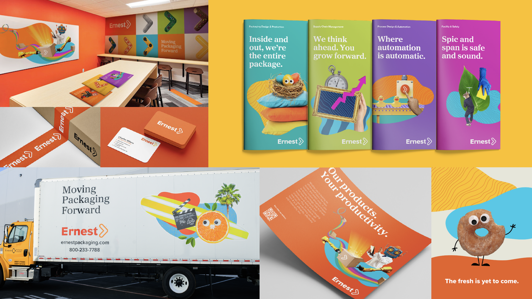
The rebrand shortened Ernest Packaging Solutions to simply “Ernest,” reflecting the company’s broader focus beyond packaging. We brought their signature quirk to life through bold patterns, collages, chevrons, and an unexpected visual language that feels unmistakably Ernest.
Partner/Copywriter: Bem Jimmerson

A new brand language
Ernest has always been fun, thoughtful and a little avant-garde. “Where’s the Ernest quirk?” is a frequent discussion around the company. Knowing the “quirk” was an asset, we turned up the volume across the entire brand language through unique patterns, collages, and chevrons.
Brand Chevrons
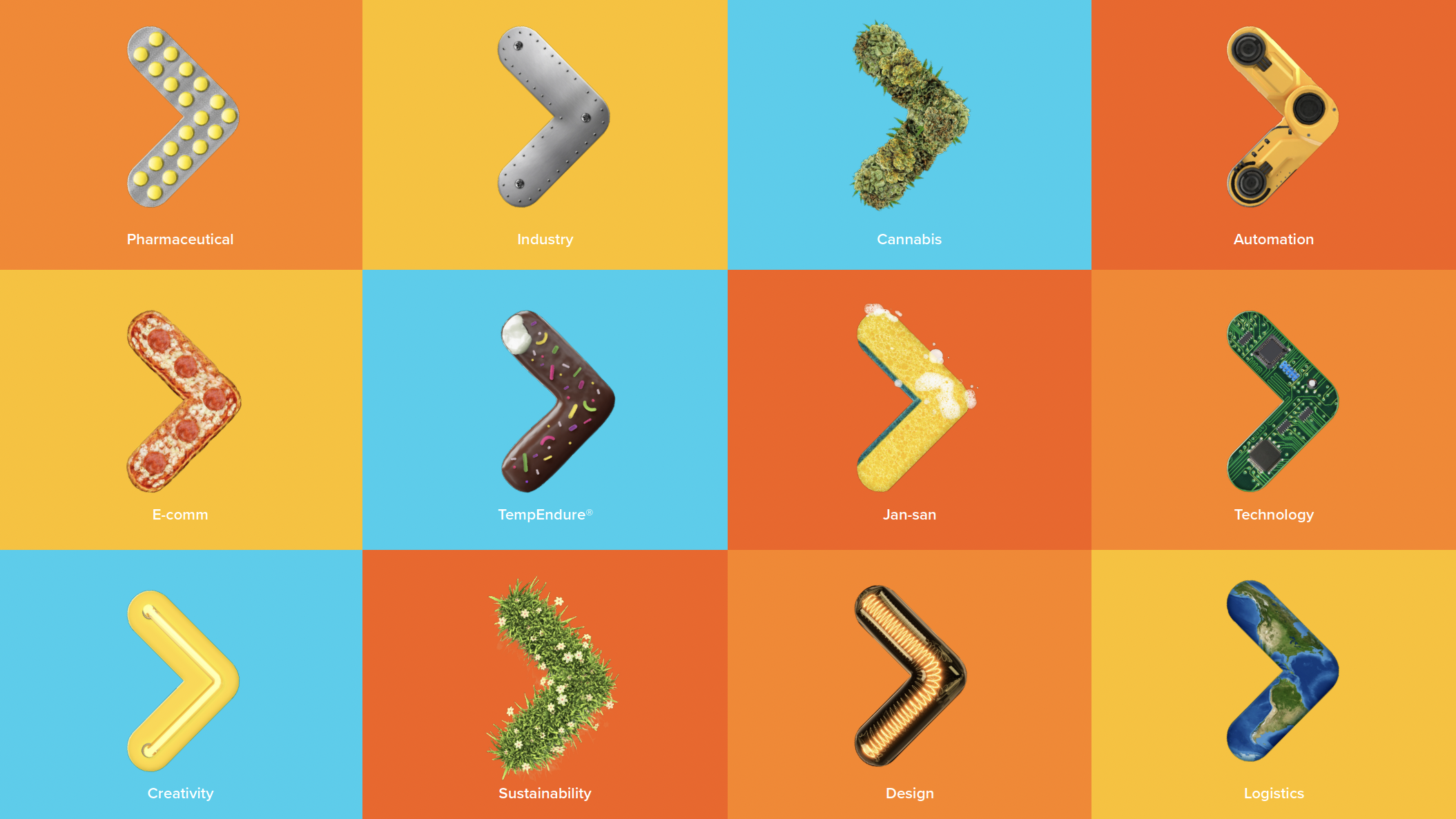
To illustrate the breadth of industries Ernest serves, we’ve created a library of branded chevrons. Derived from the updated logo, they serve as a whimsical way of showing the world they can move any business forward.
Brand Collages
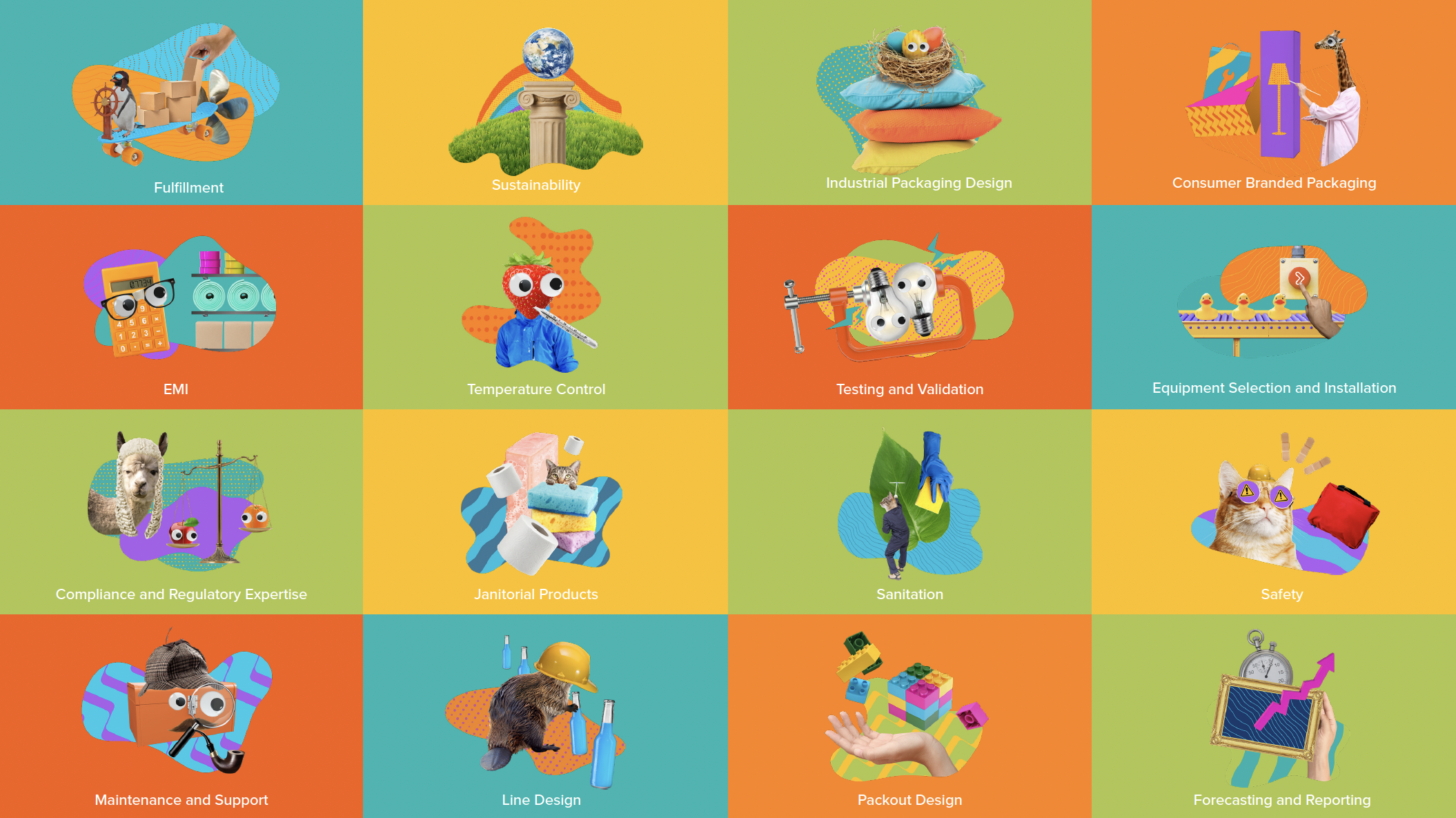
We created a flexible collage system that brings Ernest’s signature quirk to life through photography, color, patterns, and unexpected imagery. The system spans everything from services and recruiting to the website and trucks nationwide.